Forging Stronger Connections
We live in a world in constant motion.
At any given moment, of any given day, there are 1-2 billion packages in motion globally. Each one passing through the world’s warehouses, distribution centers, and logistics hubs on its way to its destination.
All that physical infrastructure is only as smart as the digital infrastructure that it runs on. Each package carries with it a series of goals, expectations, and constraints.
Shipsi provides the technology rails that bring together those insights and the physical logistics data in order to give shippers and customers a better overall experience: bringing brands closer to their customers through a delivery experience that feels seamless, reassuring, and human.
For our business partners, Shipsi is more than infrastructure behind the transaction. It is a way to strengthen their relationship with the people on the other side of the order, helping brands deliver not just products, but confidence, care, and connection.
The Logo
Our brand identity is designed to express that idea.
We infuse life and humanity into the Shipsi visual world, balancing the precision and capability of technology with a sense of warmth, movement, optimism, and ease. Inspired by the curvilinear forms of our logomark, the identity moves, folds, loops, and connects. It feels dynamic without feeling complicated; expressive without losing sophistication.
At the center of the system is our symbol: a perfected core connection. Its folded-ribbon form suggests continuous movement and an interconnected path, while its aligned, inclined cuts introduce a sense of forward motion. The softened edges of our wordmark echo the character of the symbol, creating a cohesive visual language that feels capable, approachable, and distinctly Shipsi.


Clearspace
To ensure that the logo is clearly visible in all applications, surround the logo with sufficient clear space - free of type, image, graphics and other elements that might cause visual clutter - to maximize the recognition and impact of our identity. Clear space around the logo should be equal to width/height of the 's' from each side. The clear space guide also applies to the individual elements of the wordmark and symbol when they are used in isolation.
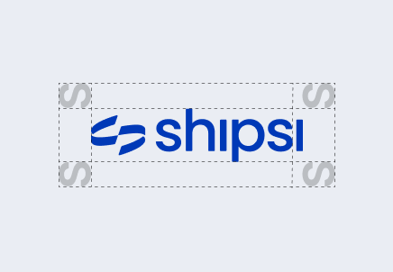
Minimum Height
36px
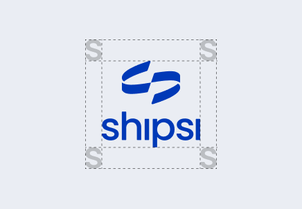
Minimum Height
72px
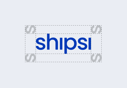
Minimum Height
36px
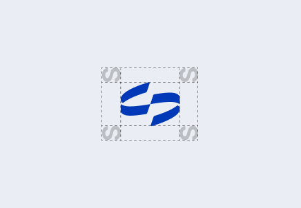
Minimum Height
24px
Logo Usage
Follow these guidelines to ensure our logos are applied appropriately across all brand touchpoints. Use only approved logo variations and adhere to established specifications for sizing, spacing, color, and placement to maintain consistency and uphold brand standards.

Incorrect Usage
To maintain a consistent and recognizable brand identity, our logos and brand marks must always be used as intended. This section highlights common misuses to avoid, ensuring all brand applications remain clear, cohesive, and true to our visual identity.
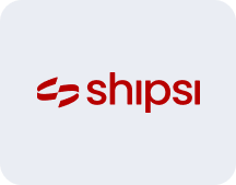
Do not colorize the logo in non-approved colorways.
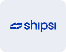
Do not re-create the logo.
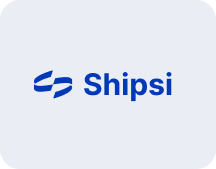
Do not change the typography in the logo.

Do not turn the logo on its side or diagonally.
Do not distort, stretch, crop or cut the logo. Use caution when scaling and adjusting the logo size. Maintain correct proportions at all times.
Do not shrink the logo beyond the smallest recommended size i.e. 36px height

Do not obscure the logo by placing it on top of a busy image.
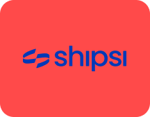
Do not place the logo on non-brand approved colors.
Our Color Palette
Color brings energy and emotion to the brand.
Our palette is vibrant, optimistic, and full of life, curated around feelings of comfort, assurance, joy, and anticipation. At its center is Shipsi Blue — an assuring cobalt that provides stability and trust. Around it, an expressive supporting palette introduces warmth, vibrancy, and moments of delight. Together, these colors allow the brand to move fluidly between dependable and energetic, confident and human.

Our graphics system gives the brand a sense of movement and possibility.
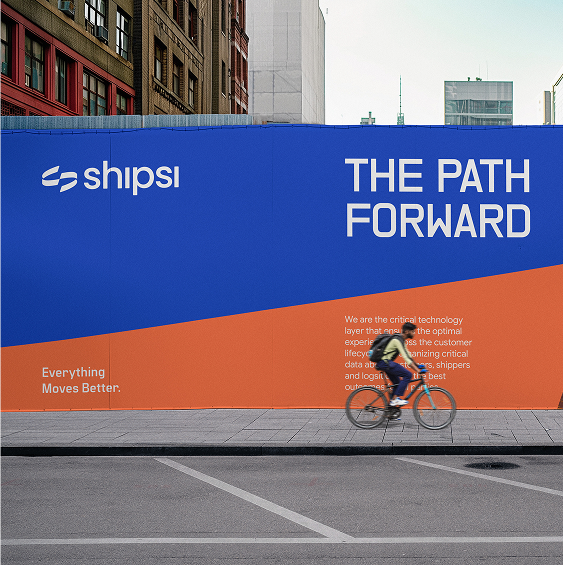
Called The Path Forward, these undulating forms take their cues from the Shipsi symbol, referencing landscapes, routes, transit, and the continuous movement of a package from one place to another. They can appear at a micro or macro scale, giving the system the flexibility to respond to everything from a subtle interface detail to a bold brand expression. The result is a graphic language that feels alive — always moving forward, always connecting what comes next.